10 Most Important Kitchen Trends For 2023
Every year in autumn, the kitchen manufacturers bring their new models onto the market. Again and again they surprise with creative ideas. But classics also remain up-to-date. We have put together the most beautiful kitchen trends 2023 for you.
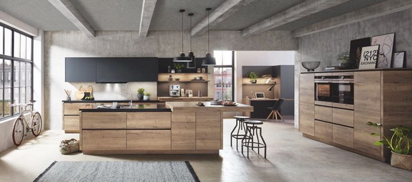
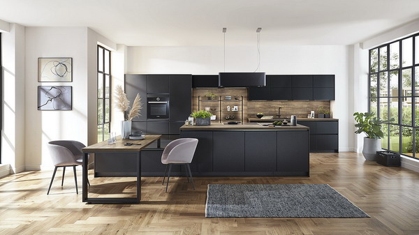
The workplace is integrated harmoniously into the open living and kitchen area. From the “Structura” series in “Havana oak replica”.
Well thought out down to the last detail – these are the new kitchens. Because here every socket and every herb pot has its place. The size of the cupboards, the interior fittings of the drawers and the choice of color are not left to chance either. A big keyword is individuality. No kitchen should look “off the shelf”. It is tailored to the needs and preferences of the owners and precisely reflects their tastes. The look is just as important as the functionality. In the meantime, the kitchen manufacturers offer a lot of innovative design ideas that create clever storage space without losing sight of the design. This includes shelves, sideboards and elements for the home office. Another aspect is cocooning. It has been talked about for a long time, but right now it is even more important.
Contents
- Trend 1: kitchens with extra functionality
- Trend 2: trendy color concepts
- Trend 3: Big appearance for matt tones
- Trend 4: New proportions
- Trend 5: Practical railing systems
- Trend 6: Noble naturalness
- Trend 7: small kitchens
- Trend 8: highlights for the kitchen
- Trend 9: country style
- Trend 10: Cozy and individual
Trend 1: kitchens with extra functionality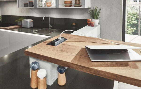
The home office
For a few months now, many people have been working from home. Most of them don’t have their own office and the kitchen has become a popular place to work. Some kitchen manufacturers have taken up the topic and offer special solutions: drawers for office supplies, sockets for laptops and the like or pull-out table tops that can be used as desks.
At Nobilia, the electricity is always available in the right place, which is particularly useful for home offices.
The utility room
Not every home has a basement to store supplies or space in the bathroom for the washing machine. It is therefore a good idea to partition off part of the kitchen as a utility room. Storage space solutions are also ideal, for example to accommodate brooms or vacuum cleaners.
There is plenty of storage space in the practical utility area, and washing can also be done here. From the outside, the room looks like a cabinet front.
Kitchen repositioned
It doesn’t always have to be the same as it was before. That is why there are ideas to position the kitchen furniture differently.
The view is undisturbed through the glass and yet a separate niche has been created for the cooking facilities.
Away from the classic island or the typical kitchen unit: only one side of the “Riva” kitchen in a “U-shape” is on the wall, the rest is free in the room.
It is often difficult to find a well-equipped kitchen in a small apartment. At Häcker, people have rethought and designed the living, sleeping and cooking functions differently than usual. Photo: Häcker
Trend 2: trendy color concepts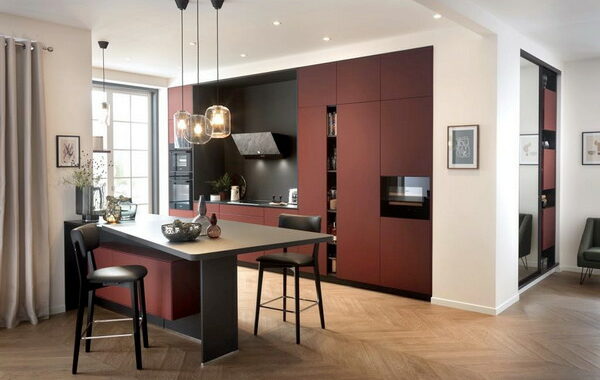
Noble and dark
Kitchens in black or the so-called dusty colors look wonderfully clean. These muted tones include shades of gray, shades of brown and blue variants, mostly in an elegant matt look. This also looks very nice in combination with wood or light details. And don’t worry: most dark fronts are provided with an anti-fingerprint seal so that floury hands cannot harm them as much.
Ballerina uses the gray “Art Pepper” for fronts and also for the interior.
The graphite black is accentuated with light materials.
Blue and green
They have long been trendy in country houses: blue and green kitchens. These colors are also finding their way into simpler fronts. The palette ranges from lighter tones to deep midnight blue or fir green.
You don’t even know where to look first. Open shelves create a new look, as do the round knobs. That flatters the rich sage green.
Red variants
Red is an all-rounder. It goes well with dark and light tones. Wood also harmonizes perfectly with it. Blush and all tinted reds and pinks are trendy right now. They do require a bit of courage, but reward with their fresh appearance. If you don’t want to choose the entire kitchen in such a color right away, you can play with accessories or paint a wall in color.
The super matt color “Nano Sirra Caneo” makes the Arcos kitchen by Schmidt shine. It has a special refinement with nanotechnology.
White fronts
They are an integral part of the kitchen landscape and are one of the best-selling colors: white kitchens. Their advantage is that they can always be designed differently with accessories and are absolutely timeless. Matt fronts are more popular than high-gloss fronts.
It doesn’t get any easier than that. The matt white underlines the Nordic style of Bulthaup’s kitchen. The light wood is a great contrast.
Color mix
Fronts are no longer allowed to have just one color. All combinations are allowed and make your own kitchen individual. Whether the second color is used for the wall units or side panels: there are no limits to creativity. However, you should think carefully beforehand whether you will like your compilation in the long term. Alternatively, colored highlights can be set with small details that are flexible.
The white of the kitchen island underlines the modern country house character of the olive green furniture.
The colorful shelves become an eye catcher. The great thing is that they can easily be exchanged again if necessary.
Trend 3: Big appearance for matt tones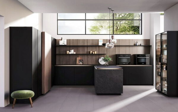
Where there was still a sparkle, a matt look now provides style. Whether for fittings or kitchen fronts, matt is absolutely trendy and appeals to purists. So that you don’t see every little thing on the surface, the fronts are often equipped with an anti-fingerprint coating.
The “Sylt” kitchen from Nobilia has a great contrast thanks to the matt black fittings.
The “Artis” fronts from Nobilia are in the color “Titanio matt” and appear noble. They have an extraordinary glass look.
Trend 4: New proportions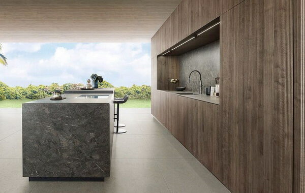
Higher bodies
This is ideal for tall people who can now work and cook at a height that is right for them. The new carcase height also offers advantages in terms of storage space. It is between 86 and 91 centimeters. Overall, this makes the kitchen look slimmer.
In addition to the previous carcase heights of 73 and 80 centimeters, Leicht now has a height of 86 centimeters. Kitchen “Bossa Walnut”.
Stretched optics
Higher, consistent fronts are the order of the day. Long, one-piece fronts are now also part of the kitchen design. The unusual look ensures elegance and an innovative character. The disadvantage, however, is that large fronts are more difficult to operate, especially with sliding doors.
Closets as far as the eye can see. You are guaranteed to have everything stored there, even if the upper compartments cannot be reached without a ladder. “Classic Oak” from Ballerina.
Of course, this only works with high ceilings: wall units that are almost twice as high. The upper compartments are best for storing things that are rarely needed. Advantage: No continuous doors have been used, only a few smaller ones.
The narrow wall units look very light compared to larger ones. This is optically a good idea, especially if the ceilings are not that high. From the “Riva” line from Nobilia.
Wall units
Eat-in kitchens are widespread. But there are situations in which a kitchen should be hidden or the wall of the kitchen should be used for other purposes. Single-row kitchens can therefore be closed with doors or sliding doors by some manufacturers.
With the large wall unit in black and wood, Rotpunkt presents a contemporary room concept for a more comfortable feeling of living.
The front of the kitchen cabinet is designed just like the wall. So you can’t see the practical storage space at first glance. “Bossa” in light oak from Leicht.
Floating elements
A hanging cabinet looks much lighter than a cabinet that is in contact with the floor. Some manufacturers have also picked up on this trend.
Trend 5: Practical railing systems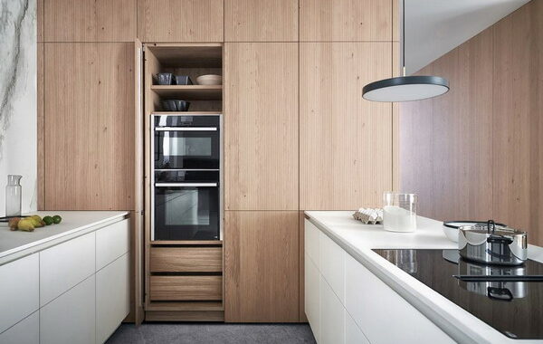
Hanging glasses and knives or herbs over the stove not only looks good, these plug-in systems also make sense. So-called function panels can always be designed differently. Thanks to their flexibility, they create new storage spaces that have never existed before. Kitchen herbs and a charging station can also be accommodated here.
The flexible railing system “Railing” from Nobilia can be designed entirely according to individual wishes.
Trend 6: Noble naturalness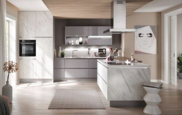
Real wood fronts
This material is not new, but it always gets innovative accents. Above all, it is no longer just about the appearance, but about the authenticity of the wood. The clearly visible grained fronts are particularly interesting. With elegant door profiles and worktops, they cast off their rustic image and appear modern and airy. The sustainability of the current wooden kitchens, which mainly come from local forestry, is important. However, wood is not completely insensitive and should always be cared for intensively.
The hygge feeling sets in at first glance. Because that results in the combination of minimalist design, light wood and marble.
This unusual look is really something new. The walnut wood of the “Bossa” series by Leicht is arranged in narrow sticks.
Back to Nature
Durable and resistant, natural materials are perfect to meet these demands. In particular, slate, granite and concrete are used, both for fronts and for worktops. Marble in light or dark is also very popular. However, it is often reworked from ceramic or quartzite, otherwise marble would be too sensitive.
In addition to light gray, marble is the main element. Kitchen “Merkur”, in “Carrara” and “White”.
Marble forms the framework for the stylish island. The combination of light wood and white emphasizes the Nordic character of the kitchen. Carpet “Rakel” in beige by Pappelina. Photo: Pappelina
Trend 7: small kitchens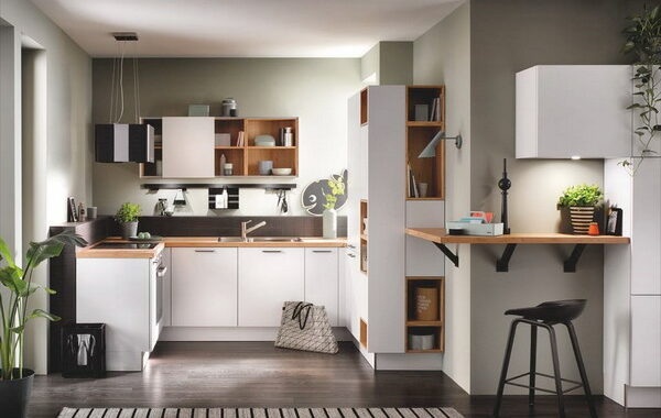
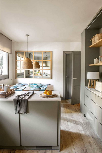
You rarely see small kitchens at trade fairs or photos from kitchen manufacturers. In reality, however, it looks very different. Many people have little space for the kitchen or even a mini-kitchenette in their apartment. For this, more and more storage space solutions are being created, for example corner cabinet solutions, scaled-down plinths or cabinets up to the ceiling.
Thanks to its open character, the “Loft” kitchen by Häcker in polar white looks very spacious.
Trend 8: highlights for the kitchen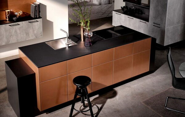
Darling copper
Not only fittings or decorative elements appear in copper, complete kitchens can also be found in the metal look.
Those who like unusual colors will get their money’s worth here. The shining copper comes into its own with black and gray.
Classic steel
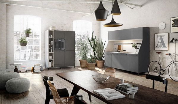
The stainless steel look ensures the industrial style in the kitchen. Inspired by professional kitchens, it is pure and yet homely.
“Inox” from Nobilia picks up on the stainless steel trend that has been shaped by professional kitchens. The fronts made of lacquer laminate are easy to maintain and scratch-resistant. A cool look.
Valuable in gold
They have slowly made their way into the kitchen world: fittings in precious metal colors. Above all gold. That looks clear and radiant. Sinks are now also available in gold. The combination of black kitchens with gold-colored handles is new.
The gold-colored handles give the kitchen a look. In addition, the individually designed niche rear wall becomes an eye-catcher.
Trend 9: country style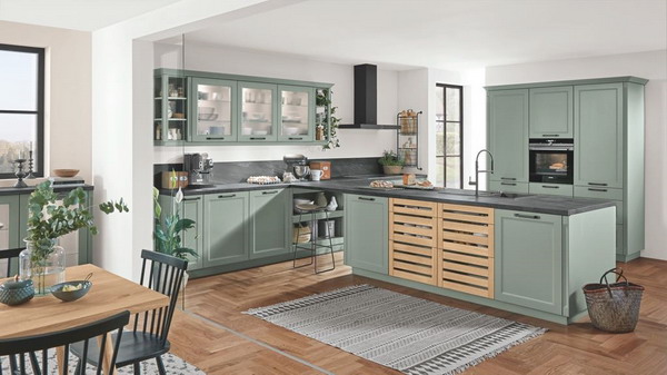
The longing for a relaxed life in the country is still there, to provide yourself with vegetables and to bake your own bread. But the look of the kitchens is being reinterpreted and now sometimes even looks more clean than romantic.
The wooden elements loosen up the front and are reminiscent of vegetable boxes. They make the “Cascada” kitchen by Nobilia very contemporary.
The fittings and the angular front decorations alone make “Casa” by Rational a modern look.
Trend 10: Cozy and individual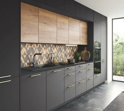
Since the kitchen is a communication space and is usually open to the rest of the living space, there should not be a lack of homely elements.
