New Design Styles for Small Kitchens In 2025
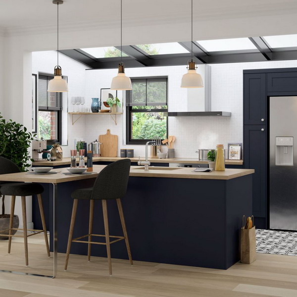
Functional and adapted solutions must be mobile and weightless, that is, the final look of a small kitchen is outlined by modern ease. Be wary of the choice of any interior item – do not clutter up the kitchen area with unnecessary and unnecessary items, the selected interior and decor items should be practical. For example, massive chairs and armchairs will only worsen the interior design of a small kitchen. And the right shade of the walls, artificial lighting and mirror elements will help to drastically improve the proportions of the room, creating a pleasant cozy atmosphere.
Contents
Small Kitchen Design Styles 2025
Modern interiors of small kitchens demonstrate a variety of styles and combinations. Their harmony borders on beauty and functionality, the quality of materials and textures. But there are areas that are more popular for small areas. We’ll talk about them.
Minimalism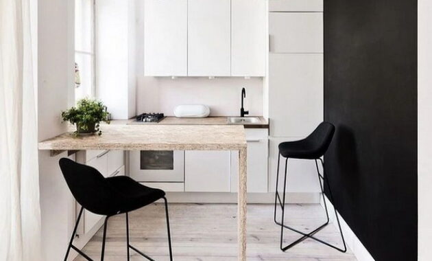
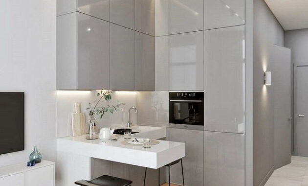
Unobtrusive design, simple forms, light tonality, functionality and a minimum of decor are the main features of minimalism. Clarity and simplicity in everything implies a built-in storage system for the kitchen, with drawers and cabinets using the “touch to open” opening system without handles and pronounced relief. Do not clutter up the space of a small kitchen with unnecessary accessories – think over your minimal set of devices. Built-in appliances, convertible furniture and folding structures fit perfectly into the small footage.
Modern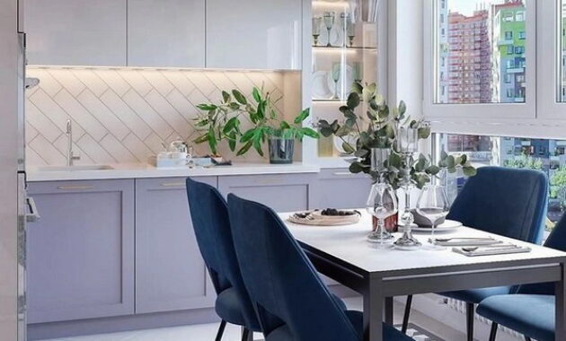
The style has the features of minimalism, so it is ideal for the design of a small kitchen. All items of furniture and decor should be practical and contain everything you need. You can use bright accents in moderation in order to only emphasize the nature of the room and set some originality. Accents can serve as home appliances.
High tech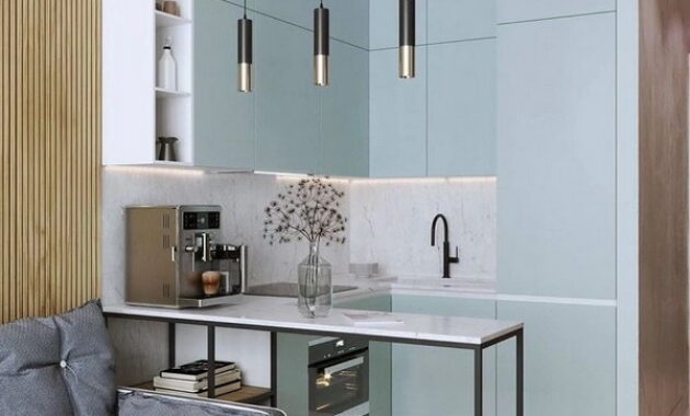
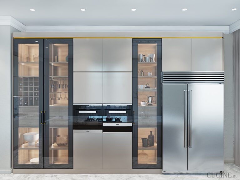
High-tech design involves smooth surfaces of kitchen facades, chrome elements, an abundance of light sources, all kinds of mirror inserts and tinted glass. Black, gray and white are the best companions in the design. Neutral tones of blue or green with a cold undertone perfectly emphasize the character of the style. The style is expressed in the use of an immodest amount of built-in “smart” technology.
Country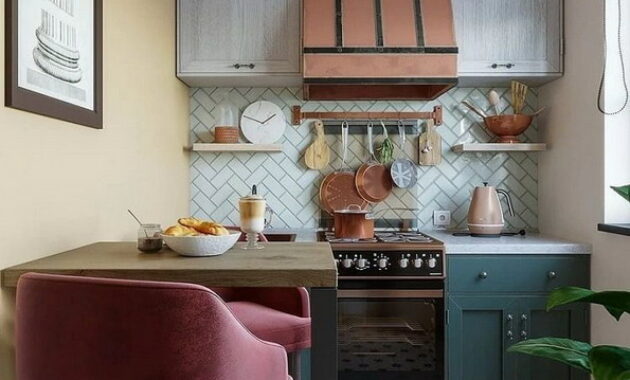
Cozy rustic design, distinguished by its features: simplicity in textures and materials, forged and wicker elements, decor of natural fabrics, natural shades of warm pastel colors. Hard textures and rough forms directly lead to a natural tree – a material that perfectly emphasizes the style. Stone is the second companion from which you can make a countertop for a work surface or an apron. It’s still not worth using massive structures made of wood or stone only in the conditions of small meters, it is better to do trim or light decoration, for example, cover the floor with a rough oak board and hang curtains made from natural linen. The modern approach allows replacing natural materials with safe alternatives.
Modern design of a small kitchen
The modern interior of a small kitchen does not impose certain rules on its design. The most important thing is to reflect personal preferences about comfort, beauty and comfort in the interior. When creating a design, you can even combine the features of different styles, but do not forget about harmony and aesthetics. Simple materials, neutral tones and modern high-tech household appliances will definitely help in shaping the look of your unique kitchen.
Correct tonality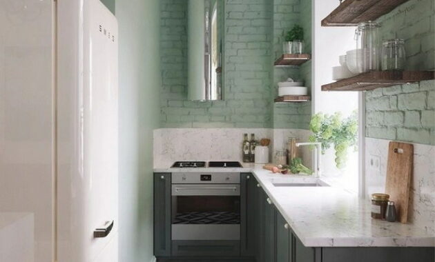
Fresh meadow shades, light pink or more classic colors at all times – white or cream – are ideal for decorating a small kitchen. By applying the correct tonality, a visual sensation of a spacious room is immediately created. In addition, the interiors of the kitchen, made in a neutral style, always look neat and monolithic. Do not forget about the trendy shades of 2025: fresh meadow, marine, delicate pink and terracotta.
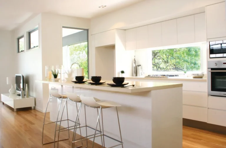
The monochrome interiors of small kitchens with white walls, floors and pieces of furniture are the real trend of 2025. Such a design technique will erase the “pressing boundaries” of the cramped space and create a feeling of spaciousness. You can also use several shades of white and combine contrasting textures: a glass apron with glossy or matte facades of the kitchen, and the walls can be decorated with imitation of brickwork.
If you like accents, then in this quality you can consider a refrigerator, an interesting countertop or curtains.
Integrated storage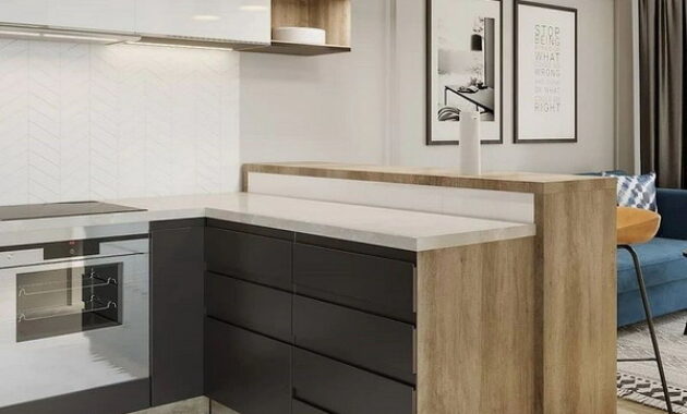
Hidden storage systems are the most relevant option not only for a small kitchen, it is a modern trend. For fans, it’s often necessary to cook, as a rule, in the arsenal there are a lot of various accessories that must be hidden somewhere. In this case, you can additionally use the height – extend the kitchen set to the ceiling by means of another additional tier. Such a place for storage will allow arranging holiday dishes, jars of jam or kitchen utensils, which are used less often.
Pay attention to functional transforming furniture and kitchen sets for built-in appliances. Folding tables, non-standard ways of storing accessories: cabinets can include hidden corners for household appliances, shelving for spices can be easily attached to the inner edge of the cabinet door, and the wall is used to fasten essential items.
The compactness in storing dishes will become more utilitarian if you purchase pots and pans that can be folded into each other. Think over the strategy of how the drawers and cabinet doors will open, which set of devices you need – as a result, the creation process will turn into an exciting quest.
The use of built-in “smart” mini-technology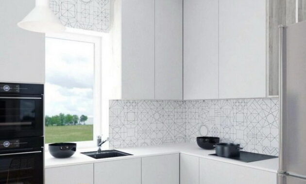
Even a small kitchen can be fully equipped with all the necessary functions for convenient cooking. Household appliances should be built-in, not stationary. This will save a little more useful centimeters of the area, and give the kitchen set the integrity of the working area. Choose household appliances that combine several useful functions at once: a slow cooker – a bread machine, a double boiler – an oven – a microwave. The hood should also be compact, otherwise it will look ridiculous.
The hob, as a rule, is standard and includes four burners at once. Think about how often you use everyone? If not, you should give preference to two burner built-in module. It is designed exactly like a full-fledged hob, only in width much smaller.
The refrigerator can be placed in a non-standard way – under the worktop. Of course, such models of refrigerators are somewhat inferior in capacity to standard ones, but if there is not enough space, the option is quite relevant.
Round table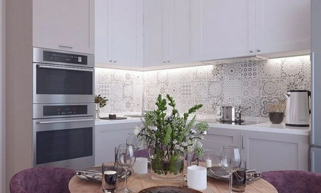
Instead of a standard rectangular table, which often looks somewhat bulky, choose an alternative – oval or round. Such a table looks more ergonomic and is able to give some space to small meters of the kitchen.
Accordingly, pick up chairs that are light in appearance and weight to the appearance of the table. The trend is still made of polycarbonate, creating the effect of “invisibility” and at the same time easy to operate.
Door rejection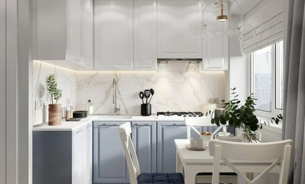
The door is another element of the interior that can occupy space in the kitchen. Reception “rejection of the door” is often used in the design of small kitchens, for example, in Khrushchev, because it increases the area that can be used to arrange furniture. In this case, the opening can be designed according to the chosen style, resorting to platbands or stucco molding, or even convert it into an arch. But if you do not accept the absence of this element, then it is worth installing a door with an opening outward or picking up a sliding one.
Using a windowsill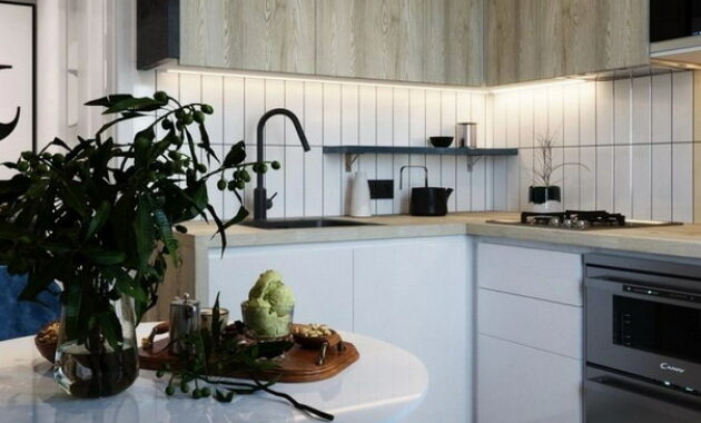
The windowsill can not be used for its intended purpose: turn it into a countertop. This solution is not only one of the most popular in modern design, but also helps visually expand the space of small kitchens. In addition, the countertop provides two full dining places, which is ideal for a small family.
Facing with mirror elements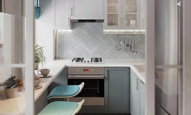
Mirrors in a small area can visually expand the space by almost half. The main thing is to place them correctly and not to overdo it. A great option to hang a mirror near the window, because in this way the room will increase the influx of natural light. It is also appropriate to mirror only a fragment of the wall, for example, emphasizing only the dining area.
If you like the unusual, then you can take note of the mirror mosaics and panels. You need to select a mirror shape following the chosen style and configuration of the premises of a small kitchen. One of the bold tricks is the placement of mirror elements instead of an apron. They resort to it when the countertop has a fairly narrow size, thereby visually expanding it. Sometimes mirrors can replace facades in a kitchen set. In this case, strength plays an important role – choose the most durable mirror glass, because undergoing mechanical stress, it should not break.
Redevelopment
If the location of the kitchen is adjacent, for example, to the living room or loggia, then you can solve the problem by combining the two rooms. Such a step will help create a feeling of spacious modern space, as well as make the small kitchen much brighter. In this case, it is not necessary to demolish the entire wall, part of it can be turned into a bar counter or given under a functional countertop.
A visually combined room can be zoned with different floor or wall finishes – this technique will help to avoid clutter and harmoniously connect the two rooms into one. For example, the kitchen area can be emphasized with tiles, and the living area with a parquet board.
Using a multi-level ceiling to decorate the kitchen area will help to divide the space and hide the necessary communications. With the help of glass partitions and sliding doors, it is possible to provide for the competent zoning of two spaces. Another useful trick is furniture separation. At the border of the two zones, place a sofa, shelving or table-island, but at the same time, these elements should not interfere with the penetration of natural light into the room.
Classic design of a small kitchen
Classic is always appropriate and timeless, but for its implementation in small spaces it is still worthwhile to adhere to some rules: bulky and too elaborate elements should be avoided. For example, massive window frames and lush chandeliers simply will not find their proper place in a small kitchen. It is worth choosing more restrained and compact pieces of furniture with a concise design.
A small kitchen can be called initially a fairly complex platform for decoration, but you can still achieve a perfect result, thanks to some secrets. Practicality and minimalism are two faithful companions for any small kitchen in Khrushchev. In addition to placing on a small area all the essentials, you need to remember about ease of use.
The kitchen is the most visible and sometimes bulky element. For a small kitchen, it should be more ergonomic and neat, with plain facades without noticeable details and crevices. The comfortable use of the “working triangle”, namely the refrigerator, stove and sink, depends on the configuration of the kitchen set. The main points of activity are at the corners of the figure, between which, when cooking, a person should move freely. In the conditions of a small-sized kitchen, it is best to use headsets in the form of the letter P or G. Moreover, options for linear or parallel arrangement of the headset are not excluded. The final layout depends on the parameters of a particular room, the location of the window and doorways, as well as the main communications.
Choose built-in smart appliances that make your kitchen design easier. If there is not enough variety, then you can add zest to the kitchen interior with the help of an apron made of durable triplex glass, having previously placed an interesting print on its surface. As for the dining area, often small kitchens can not accommodate a full, so you have to look for another solution. One of the good options may be to place a narrow bar counter with high stools or folding structures. The role of the dining table can perfectly fulfill the converted window sill.
Design of a small kitchen 6 sq. m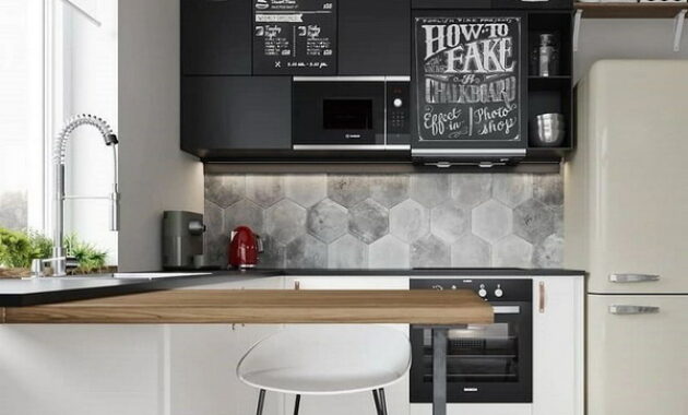
The secret of a successful kitchen layout is 6 square meters. meters, primarily determined by the placement of all kitchen furniture. Since the main content of the kitchen is household appliances and furniture, it is worthwhile to determine in advance the exact location of the refrigerator, stove and sink. Here, sometimes you can not do without the services of manufacturing custom-made furniture strictly according to your size, because standard items occupy, as a rule, much more than the useful area of a small-sized kitchen. It also gives an incomparable advantage, because such cuisines are truly unique.
When creating an interior, do not focus too much on small details. Choose your favorite style and create within it. It is perfectly acceptable to replace some elements with available alternatives. For the design of an area of 6 square meters. meters palettes of light shades, oval and round shapes of objects are ideal. But clear lines in this case should be avoided, as they can already narrow the small space of the kitchen.
If the room is in the shape of a square, then the placement of a U-shaped kitchen set is ideal. You can place a sink near the window, and the stove and refrigerator are symmetrically closer to the center of the walls. Thus, the fastest access to the main peaks of the “working triangle” will be fully ensured. L-shaped headset can be used if you intend to leave free space for the dining area. The sink is best mounted in the corner, and the rest of the items on opposite sides of it. The narrower rooms, resembling a rectangle, are optimal for placing a linear and parallel headset.
Design of a small kitchen 5 sq. m
Small kitchen with an area of 5 square meters. meters often leads to difficulties for its owner, because it is still a task to properly organize the workspace and dining area. First of all, in order to get a functional and comfortable room for a small kitchen, you need to think through a “working triangle”. It is necessary to deal with the cooking process in conditions of convenience, when all interior elements and objects are located in direct access. Therefore, the functionality of the arrangement of furniture implies the most compacted number of interior items without frills. Kitchen sets in their configuration can be very different: L-and U-shaped, as well as linear and parallel. Making furniture to order will be the best option for organizing the space of a small kitchen. The more tasks one subject will perform, the better.
You can also resort to the unification of space, which will increase the area of the kitchen. You can combine with a living room or a loggia. Between the two rooms you can install a sliding glass loft partition or arched opening. Loft partitions have a great advantage – a thin profile and high throughput, so that the kitchen room is filled with daylight. You can also use a standard door, but with a glass cloth, which also allows you to adjust the small footage. An interesting accent that visually distracts attention from modest meters of the kitchen will also help to win the area.
Design of a small corner kitchen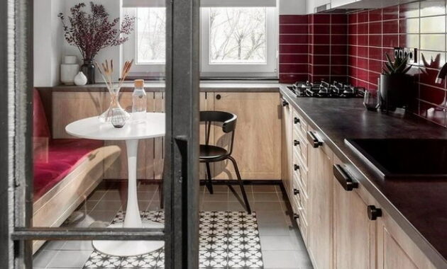
The angular configuration of the kitchen is considered one of the most popular, because its functionality is as compactly integrated as possible. Furniture and household appliances are located near two adjacent walls, forming the letter G, thereby leaving room for a full dining area. To create such a kitchen in a small area, you need a room that is close in shape to a square, then all the elements will be conveniently located, and not just fill in useful centimeters of the area. In addition, the corner option can be called a universal option for arranging a kitchen in any style.
The options for the corner kitchen depend on how the furniture is connected. It can be performed in three ways, as a result of which the design of the corner cabinet acquires a different shape: straight, beveled or semicircular. A right angle connection is the most functional and convenient way in a small kitchen area. Thus, it will be possible to arrange the headset more compactly and conveniently.
The corner kitchen allows you to put a refrigerator, sink and stove according to the rules of the “working triangle” – at an equal distance from each other. This will save time for cooking, because all the main items will be in direct access. The system of internal storage of kitchen utensils is also fully provided, it is possible to zone the space on the working and dining area. Think over the little things – for how many people the kitchen is equipped, what appliances can include several devices at once, etc.
No less important role in the visual expansion of the space is played by light sources, but with them, like with the decor, the rule of harmonious quantity, contributing to the comfort of the room. It is better to hang the main light source over the dining area or in the center, and spotlights can also be placed along the perimeter of the ceiling. Do not forget about the working area, be sure to organize a scenario for its lighting, using LED strips and a separate switch.
Expert Opinion
One of the most popular styles of 2025 is a modern classic. Such a kitchen usually has a solid color, facades with easy milling, and the general tendency is to extend the upper cabinets to the ceiling. Dissolving the appearance of the headset and arranging its accessories is necessary for minimalistic facades, thus, the modern interior of the kitchen will become light and attractive.
Popular questions and answers
How to distribute the space of a small kitchen and accommodate everything you need?
If the kitchen is small, then the following principles must be followed.
Decide whether a cooker is needed for four burners or just two are enough, so you can provide +30 cm to the work surface, which is missing most.
Kitchen cabinets are best made to the ceiling. At the same time, the upper cabinets should not be split into two parts, but made one tall (1 m high). If the height of the ceilings of the kitchen is more than 2.7 m, then you can divide the cabinets into two parts.
The oven is best placed under the stove, and the microwave (if necessary) is built into the upper drawers. The free space can be added to the working surface of the kitchen.
The refrigerator is better not built-in – it is more democratic (and the kitchen itself will be cheaper), but it is about 25% larger in volume. Typically, the layout of the kitchen is approximated in shape to a square or rectangle, on one side of which there is a door, and on the other a window. Because of the battery, the wall with the window is often not filled with furniture. Therefore, as an option, deepen the battery into the wall and continue the kitchen along the wall with a window. There is nothing more refined than a sink by the window.
Basic techniques for the visual expansion of the space of a small kitchen?
In 90% of cases it will be true to make a white kitchen and light walls. Apron – large format tiles. On the floor, too, no need to grind. The ideal tile size is 60 * 60 mm, this condition also applies to the apron. Place the cabinets close to the ceiling to visually raise the height of the room, because they are usually not tall in small apartments and Khrushchev.
For those who are especially brave, I would recommend mirrors, for example, along the wall where the table is located. The ceilings are white and without levels (it will be good to use a stretch mat ceiling). Porcelain tiles on the floor and on the apron are better to choose one color, and indeed from one collection, so that there are fewer colors and textures.
What trend color combinations and textures are best used to design a small kitchen?
I would use 80% white. The floor and countertop would give warm shades. The room and set can be made white, and the accent is decorated with brightly colored chairs, curtains or an apron. It will look aesthetically expensive, and visually a small room will seem larger. Also good solutions are when a light gray color is used in combination with a white kitchen.
What should be the lighting of small kitchens?
The first group of lighting is the apron illumination, the second is the lamps along the kitchen furniture. It is very cozy when there is a chandelier hanging low over the table. She zones the dining group, even if the kitchen is not big.
Do not forget that the upper drawers of the kitchen set may not always be deaf. It will look good if 1-2 drawers are with glass and a backlight is built in. This decorative lighting also adds to the beauty of the kitchen.
And what interior design trends do you like? Share in the comments!
