Rules For Combining Colors In The Interior Of The Kitchen
 The combination of colors in the interior of the kitchen, without exaggeration, is the most important thing! You can spend a lot of money on finishing, buy expensive furniture and accessories, and in the end, get something colorful and completely unattractive.
In this article, we will tell you and show you with simple examples how to choose kitchen colors.
You will not find any abstruse terms such as “monochrome”, “achromic”. No theory and obscure reasoning!
Let professional designers use this, and we will go the other way: we will start from the color of the main subject of the decor, and already try on it different options for contrasts. And along the way to argue what is good and what is bad.
We are sure that among all the variety of examples offered, you will certainly find something suitable!
Contents
The Basic Rules For Combining Colors In The Interior
The basic rules for combining colors in the interior are as simple as two or two: do not try to embrace everything at once and do not use all the colors you like at the same time!
That sounds easy, right?
But, when it comes to business, this is what starts: “Or maybe I should buy an backsplash in this red countertop, in a lilac-coral tone? Or, in orange red? Or, in terracotta brown? Not? Bust? Then maybe buy purple chairs and curtains?”
As a result, it turns out what we said initially: an overload of bright elements that form a chaotic mess, in which not a single item “plays”.
And no matter how difficult it is, it is necessary to highlight something ONE, which I would like to draw attention to first of all!
How exactly to do this, we will tell a little lower, and now reassure those who want everything at once.
For such cases, there is the beautiful Boho style, which we will also talk about later in the appropriate section. Excesses are welcomed there and you don’t have to worry that you are overdoing it.
Rule 60/30/10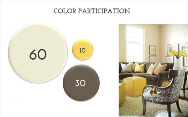
And here is another rule, more specific and most useful. Perhaps, besides him, nothing else an amateur should not bother with, as it works 100% efficiently.
Law 60/30/10 means that the interior should have no more than 3 color schemes, and their distribution is as follows:
60% – dominant color
30% – complementary color
10% – emphasis
Here is the attention!
The dominant color is not the same, your very favorite and that you want to apply everywhere.
Dominant is the background color on which other colors will be clearly visible: the additional and most important one on which I want to emphasize.
For example, if you like red color very much, then to achieve that it is noticeable, but at the same time unobtrusive, it needs only 10%. And no more.
Very well, the meaning of this law is displayed in the photo below . Unfortunately, this is not the interior of the kitchen , but the main thing is to show you the rule using a living example:
As you can see, observing this rule, we get an interesting effect.
The room is essentially beige and brown, but we see it as yellow!
And, if you emphasize overload, the view will look something like this:
Looking at this photo it is recalled: “Horses mixed up in a bunch, people …” ©.
And for some reason, we are sure that the owner of the interior wanted to emphasize the red color, but simply went too far.
And in the end, against the background of this brightest red spot, there is no kitchen furniture, no stylish hood, or a beautiful tile on an backsplash.
Of course, there are designers who will immediately say: and this is not bad taste, it’s just a monochrome interior (that is, in which there is one color and all its shades).
But, you yourself understand that this is just a beautiful theory and words. But in fact, we see just a red spot, from which it hurts the eyes.
So, you have to think carefully and decide what is really important for you.
And one more thing: the rule of three colors does not mean that you need to choose only three colors.
It means that 3 colors are acceptable.
That is, if your wall is light beige as a background, then the floor can be made dark beige, and the carpet is almost white. But, all these shades need to be laid out in 60% of the original percent.
The same goes for the second color and accent. But, here, too, without fanaticism. The run-up for two or three tones will look organic, but the big contrast is already like two different color schemes.
Naturally, the room will not do without a fourth, fifth color. No other way. But, their share should be very small.
The Most Important Subject On Which I Would Like To Emphasize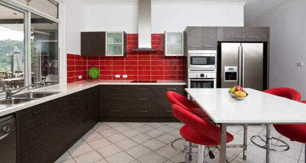
So where do we start? Of course, with the choice of the part or object that you consider the most important and beautiful of the whole environment.
It could be:
- Wall decoration
- Work backsplash trim
- Kitchen furniture
- Stylish accessories
- The latest household appliances
No matter how you would like, but you need to choose one thing on which you want to focus. And it is this element that should include the primary color that you focus on (in the ratio of 10% of the rest).
Let’s say you have an incredibly beautiful working backsplash on the wall, red.
Then, you focus on it, and add a little more red as impregnations to the rest of the details: a small inclusion of red in the chandelier, paintings, decor.
Very small, keep in mind! So that in total you get only 10% red.
But, let’s take a closer look at each moment.
Building On Wall Decoration
If you dream of an unusual and catchy finish of the walls, then you have to say goodbye to the idea of too bright furniture, catchy accessories and unusual flooring. The walls, which are decorated elaborately – are very binding.
And so that you can carefully consider them, you have to give up the rest of the things and choose their most neutral appearance and color.
If you are ready to lose all this for the sake of colored walls, then act!
If you want to emphasize the intentional asceticism of the walls (for example, just white, without decorations and other decorations), then you need to choose contrasting accessories against which the white wall will look very appropriate and elegant.
This refers to paintings, chandeliers, shelves, etc.
White Walls
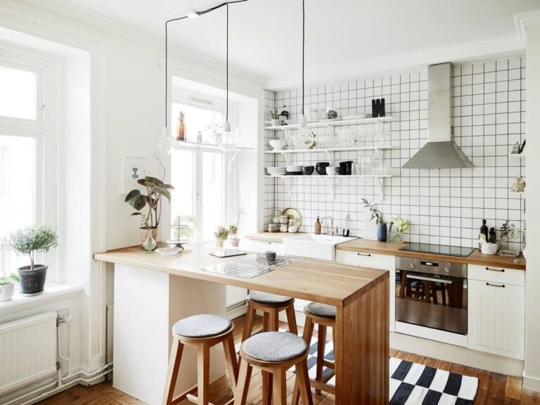
The combination of white in the interior of the kitchen is possible with almost any color of the spectrum.
But, if white is taken as the background, then the best second color is the color of light, natural wood. And already accent – whatever.
To come up with something better is simply impossible!
With this classic combination, almost any accent will be appropriate, except for dark brown and black.
But if black is made the second color, and the tree is accented, then a very elegant look comes out!
In a word, the combination: a white wall + unpainted wood is a classic that is good in any interpretation.
Colored walls (photo wallpaper, ornaments, etc.)
If you have catchy walls, then the furniture should be as simple and unobtrusive as possible. Otherwise, these walls simply mix with the cupboards and there can be no talk of any elegance.
The combination of colors in this case should be something like this: a colored wall and plain furniture, moreover, in a contrasting color, and not just one color scheme.
The best option for the second tone in this case:
- White
- Gray
- Brown
- The black
If you are at a loss to choose a good contrast for the second tone, then you can use the range of color matching.
Moreover, it is better to do this online, on a special service: colorscheme.ru
There you can pick up both contrasts and the color scheme of mono-color.
If you figure out how to use this site, then you will never again face the question of how to correctly combine colors in the interior of the kitchen.
Stone Walls
The stone wall is a very bright element of the decor, which combines little with anything other than white and light beige.
Any other color will simply “kill” the natural color of the stone, and it will not look expensive.
But if the stone itself is white, then it is easier in terms of selecting a second color. But, here you still need to take into account that not every material of furniture or other decoration is combined with stone.
No plastic, MDF, metal – can no longer be here. Only natural materials and the simplest design possible.
Walls with sculpting or plaster drawings
If there is modeling on the wall, it is best that the main background is white. The stucco pattern can be absolutely any and better, so that its color is accented, that is, it is only 10%, which we talked about above.
From A Working Backsplashes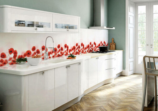
A bright working backsplash is such a detail on which a lot depends.
If you make colorful walls, then its beauty will fade. The same applies if the kitchen furniture is matched to the tone of the backsplash.
For example, now quite popular combinations are as follows: a colored backsplash made of tempered glass and a bright kitchen to match.
This is ugly to say the least. And too intrusive. Here’s what it looks like:
If you have a colorful kitchen, then no motley backsplashes! This is the law.
If a colored backsplash, then no bright kitchens. It is important.
Here’s what a colorful backsplash looks like in combination with neutral furniture:
There is a difference, right?
And now, look at how the backsplashes look in color schemes. We have selected the most successful combinations and interiors with the right color.
Red backsplashes
Red color does not tolerate the presence of many shades of its spectrum nearby. That is, pink, coral, burgundy, etc.
Only the correct contrast is combined with red or black, brown, gray and white. The latter is a win-win choice.
Also, mirrors are perfectly combined with a glossy red coating.
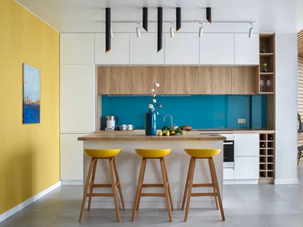
Backsplashes in blue and blue tones
Blue “loves” white background color and natural, unpainted wood as an additional, second tone according to the formula of three colors.
But blue, without any additives – the option is not the best.
Blue is best used as a complementary color, as it is too light for emphasis.
And so, it looks great paired with: light green, lilac, white and black.
Backsplashes in green tones
Green color goes well with yellow. If we are talking about shades of green, such as pistachio, olive and others, then yellow should be in their color scheme.
That is, sand and mustard are suitable for olive, but not pure yellow. Well, it also blends with white, just perfect.
Backsplashes in orange and yellow
Orange is “friendly” with light green. Very good and fresh combination. Brown is also very suitable for orange. It is definitely not worth combining orange with yellow, blue, purple, and purple.
Natural backsplashes
Here you can also say that about the decoration of the walls with stone. If you have an backsplash made of marble, then select furniture or floor to match the color of its veins.
If from granite – then in color you can make the same window sills. In general, once again somewhere to duplicate the material, not exceeding 10%.
Backsplashes with ornaments
If you have an backsplash with some kind of ornament, for example, with an oriental one, then it would be nice to duplicate it either in curtains, or in tiles on the floor or in the chandelier. Everywhere it’s not necessary to “shove” it, otherwise exorbitant variegation will come out.
Furniture and walls should be neutral in color and texture.
Based On The Color Of The Countertops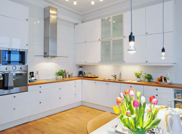
The choice of countertops is an important thing at the planning stage. If you do not want to be “attached” to her then, do not choose a catchy thing. And if you have already chosen, then be sure to consider this when choosing the rest of the color scheme.
Natural stone countertop
Stone countertops are very beautiful. But, to put only a countertop, without taking this stone in any other place in the kitchen, is not worth it, otherwise it looks like a foreign object.
You can stone: window sill, a small part of the wall or floor.
But, in no case do not make an backsplash exactly to the tone of the countertop! This is not a good solution.
Wood worktop
The wooden worktop blends perfectly with the wooden dining table, chairs, wooden windows and shelves. But not with wooden furniture in kitchen cabinets.
Rather, they can also be wooden, but already painted, rather than a natural color. Otherwise, you will make a strong emphasis on unpainted wood, your kitchen will begin to resemble a sauna!
What about the color of the walls, the optimal one is white. But the second tone is olive, blue. These are the most win-win options that are often used in interiors such as Provence .
From The Color Of Kitchen Furniture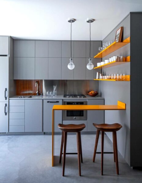
The combination of colors in the interior of the kitchen, most often depends on what kind of furniture you have.
Of course, if you are doing design from scratch and haven’t bought anything yet, then it’s easier for you.
But if the furniture is already there, then you need to “dance” only from it and there are no other options, since it occupies a large space and is the second, auxiliary color.
Unpainted wooden kitchen
As a background for such a kitchen, the best is white walls.
And as accents – any colors other than brown and dark orange. They will almost merge with a natural tree.
White kitchen
White furniture looks great on the walls in contrasting colors. That is, if kitchen furniture is our 30%, then the background is 60%.
What color is combined with white – it makes no sense to list, since it is combined with absolutely any color!
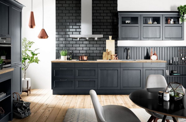
Red kitchen
The red kitchen combines very well with gray, stainless steel and a mirror surface.
Also, it creates a good contrast with black, but it should be no more than 10%, otherwise it will be very dark and gloomy.
In addition, the red kitchen goes well with blue and white. This trio resembles marine colors and looks very fresh.
And here is a wonderful version of a white and red kitchen. Here, although the percentage balance of colors has not been observed, it still looks pretty nice.
Brown Kitchen
Brown – the color is very moody and does not tolerate almost any neighbors, except for white and beige.
The rest of the colors must be applied very carefully, otherwise, all the beauty of the brown kitchen will fade against a bright background.
Also, remember this: if you have brown furniture, the floor must certainly be bright. Otherwise, the view of the room is dark, and sometimes even messy.
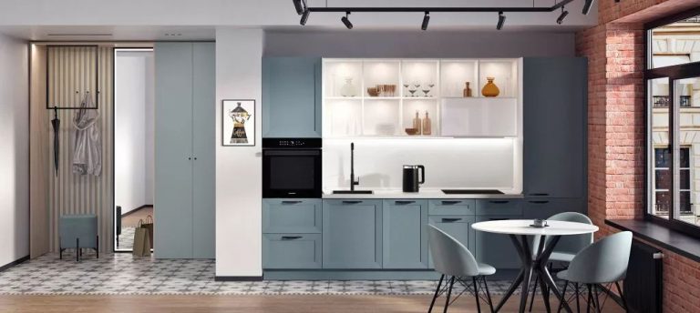
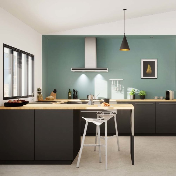
Kitchen in blue tones
The blue kitchen should not be combined with any colored walls. The maximum is the faint gray-blue tone of the wall. And better – just white.
On other backgrounds, blue just does not look as bright as we would like.
Green Kitchen
This is a very bright kitchen if the color is saturated. It is better, of course, to choose either olive or pistachio-colored furniture.
But, if you already have a bright green kitchen , then the accent to it can be blue or lilac, and the background can be light yellow or white.
Lilac Kitchen
Lilac furniture goes well with light green shades, olive and khaki.
Also, lilac is combined with maroon, white and black. Sometimes, a pink accent looks good, but if there is an additional, the fourth color is black.
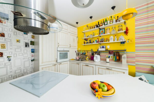
Yellow kitchen
The sunny, yellow kitchen goes well with a light green accent, lilac, as well as red. And as a background – perfect white. However, it is always perfect.
Building On Accessories And Textiles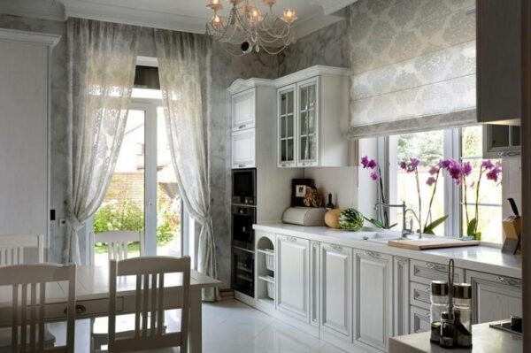
If your main goal is to emphasize the presence of beautiful gizmos, then just paint the walls white, and lay on the floor an ordinary, wooden floor.
No more extra decorations needed! Kitchen furniture in this case should also be as natural and discreet as possible: painted or unpainted wood, white plastic.
Not many styles are rich in accessories and textiles.
These are country options and ethnic. It makes no sense to list all of them, we will consider only a couple of the most popular directions.
Accessories in the Provence style
The accessories in the Provence style fit wood painted in blue, blue and green and forged elements painted in black.
There is nothing more to add, since the accessories and colors of the curtains are diverse and here your task is simply to correctly combine them together.
Among them, there should also be something background: for example, textiles (curtains, a tablecloth interspersed with an accent), and the rest of the decor should contrast with them. There should be little emphasis.
Boho Style Accessories
And here you can roam to the fullest! Boho is a style of Czech gypsies living in Bohemia.
Everything is already pertinent here: walls painted in several colors, and at the same time a lot of incompatible accessories, various texture of furniture and decoration.