5 Kitchen Design Trends That Will Be Relevant In 2022
Natural textures, open spaces, color blocking – we are talking about these and other latest trends in kitchen design 2022 in our selection.
The main global trend in modern design is the lack of frames. This applies not only to fashion and style, but also to the interior. Do you like provence ? Let the apartment reflect the love of country motives. Minimalism? Try the play of textures and shades. Monochrome? And that’s great, your house is your rules.
Nevertheless, there are a number of trends that are at their peak of popularity today. They will not go out of fashion either this year or next. And they will be relevant even in a couple of years. Consider the kitchen design trends 2022 with a photo.
Contents
Five kitchen design trends 2022
1. Combining space
Take a closer look at the projects and layouts of modern apartments. More and more often, designers and the owners themselves are making a choice in favor of open spaces – combining the kitchen with the living room and dining room. From a functional point of view, this is justified: we spend more time in these rooms, so why not expand the possibilities for design, using the entire area, without unnecessary walls and partitions.
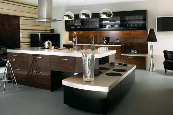
The filling of the space depends on the available space. Kitchen design with an island is one of the key trends. This element becomes the centerpiece of the room. Both in terms of design and functionality. The bright island transforms into a bar counter, a table, it has additional storage space. In a private house, you can implement more daring ideas, for example, build in a stove or even a stove.
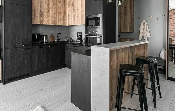
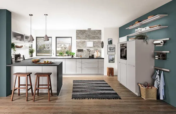
In a smaller room, the central element is the bar counter separating the cooking area and the living room. Or a dining group. Both can become accents in the design.
2. Textures in modern kitchen design
It’s no secret that plastic and deliberately artificial materials have faded into the background today. Natural and futuristic textures are in trend.
Wood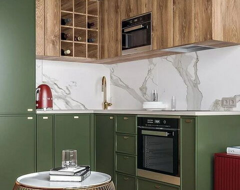
Increasingly appears in the works of Western and domestic designers. This is not only a set, but also individual elements – an island, a dining group, perhaps even a part of chairs in a group. Wooden panels look especially impressive as an accent in decoration. The tree retains its natural texture, it is practically not painted – this is important. Saturated dark walnut or light pine – choose based on the overall range. This texture will soften even the coldest decor.
Metal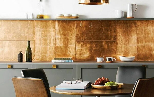
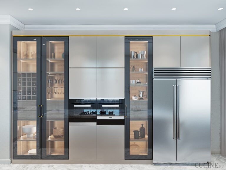
Another texture that is becoming more and more popular. It is not only about individual accessories such as lamps and handles, but also about large surfaces. As an accent, you can consider a kitchen island covered with brushed metal, an apron made of metal mosaic or whole panels. Such material will not be appreciated by everyone, it will suit a modern interior, minimalism or hi-tech. Do not forget about strict forms and laconic decor – a stylish solution with a bias towards futurism.
Stone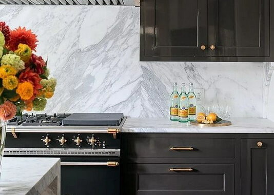
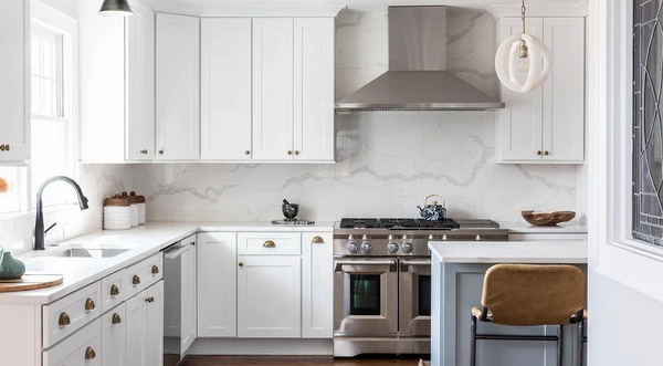
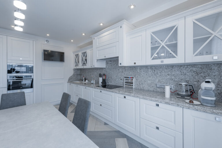
Not a new trend, but it is not losing momentum. Almost all options for stone finishing are relevant: onyx, marble and granite. Artificial stone and porcelain stoneware as budget counterparts are also suitable, but be careful with them. These must be quality materials that can replace the standard.
The stone is used as an accent in the design of an apron or table top. Large stone slabs look spectacular – for example, in the same island or bar counter. At the same time, you should not be limited to a natural color scheme. Today, designers are experimenting with brighter materials in blue, green, with veins of silver and gold.
3. Color-blocking for bright solutions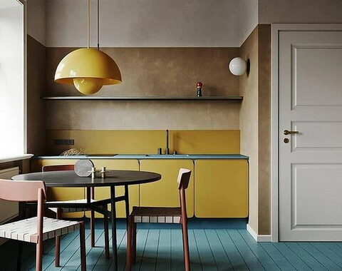
This is an actual technique in the design of a bright kitchen. The main idea is not to spray colors into small pieces and prints, but to use a color array. Thus, you can select entire zones, emphasize and correct the geometry of the room.
- In the interior of the kitchen, color-blocking can be used in the design of the headset. For example, in experiments with a combination of cabinets. If you like the idea of multi-colored bottom and top rows.
- A group of rest in a united space can become a bright spot. Designers skillfully combine sofa with decoration. She may even become his continuation.
- If the idea with bright furniture is not close to you, you can implement the principle in decoration. Moreover, this can be not only an accent wall of saturated color, but also color spots, lines and decorative patterns.
4. Kitchen design in two colors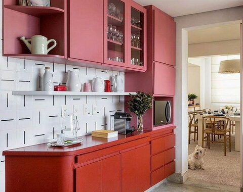
Another trend related to colors and gamut choices. In Western and domestic projects, you can increasingly see projects designed in two colors.
Usually a neutral base color and a brighter secondary color are chosen for this. In the photo, the design of a modern kitchen in light colors no longer looks boring, it is diluted with a more colorful one. And not necessarily saturated, it can be muted pastels.
- The combination of colors can be traced everywhere: this is the decoration, and the choice of the headset, and the dining group.
- In decoration, the base can be complemented by an accent wall, which will support an additional color.
- The solution for a headset in two colors is not only a split top and bottom, but also verticals. For example, combinations from different cabinets.
In such interiors, very few accents remain, not even the canonical 10%. Handles and mixer may differ. But it is better to choose small household appliances in two basic colors.
5. Monochrome in dark colors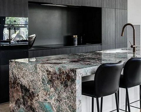
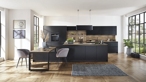
Monochrome in neutral tones is a well-known principle that many are already tired of. The designers went further, and today they propose to decorate the kitchen in dark colors. Moreover, without strong dilution with light or even basic ones. This interior looks very impressive and dramatic!
- Both the decoration and the headset become dark. But light notes can be found in the countertop, dining group or apron.
- This solution is not suitable for every apartment. And it’s not about the size, because even small rooms in a dark monochrome look visually larger. But there should be plenty of natural light in the room. So that the resulting space does not turn into darkness.
- Textures are also important here. Add wood, stone, glass, concrete or ceramics – make them different and create an interesting mix of shades and textures.
